What is a Line Graph?
A line graph, also known as a line chart or a line plot, is commonly drawn to show information that changes over time.
You can plot it by using several points linked by straight lines. It comprises two axes called the “x-axis” and the “y-axis“.
- The horizontal axis is called the x-axis.
- The vertical axis is called the y-axis.
Line Graph Definition
A line graph is a graphical representation of information that changes over a period of time.
It is a chart made by joining points using line segments.
Recommended Games
Parts of a Line Graph
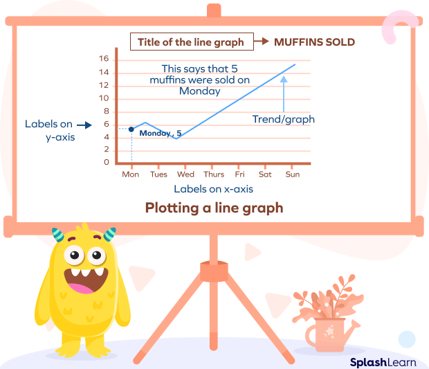
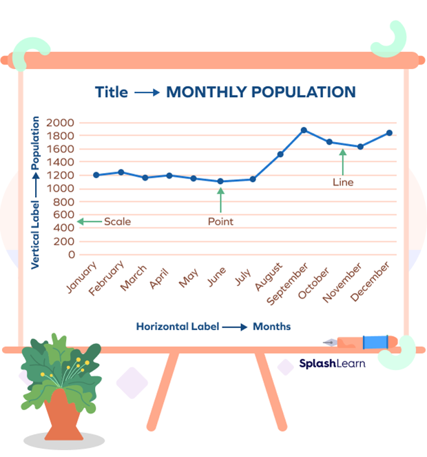
The image shown above represents the components of a line graph.
Title: It tells us about the data for which the graph is drawn.
X-axis: It tells us about the label on the x-axis, which is the time interval (days of week in the above example).
Y-axis: It tells us about the label on the y-axis, which is the quantity (muffins sold in the above example).
Scales: The horizontal and vertical scales tell us the quantitative value of “how much” or “how many”.
Points: It represents the (x, y) ordered pair.
In the given figure, the point represents that five muffins were sold on Monday.
Trend: You need to connect the points to make the graph. The meeting point of the label on the x-axis and y-axis reveals the movement.
In the above example, the line connecting these individual data points gives a picture of whether the trend of the sale of muffins is increasing or decreasing.
Recommended Worksheets
Types of Line Graphs
There are three types of line graphs.
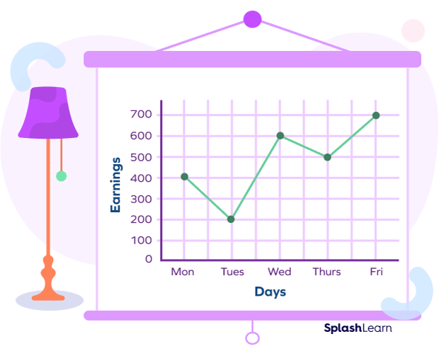
- Simple line graphs: It is formed when you draw just one line to connect the data points. It is also known as a linear graph.
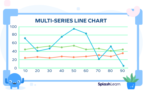
- Multiple line graph: It is formed when you plot more than one line on the same axes. Such a graph shows a change in similar variables over the same period.
Properties of Line Graphs
- It is drawn using straight line segments between points. By joining all points, we get a resulting line that may be a straight line or a curve.
- It has two variables: one is independent while the other is dependent on the first independent variable.
- Ideally, the independent variable is exhibited on the horizontal axis, and the dependent variable is shown on the vertical axis.
- It can show the variation of one quantity with another, also known as variables.
How to Make a Line Graph?
- On the graph paper, draw the x-axis and the y-axis. Do not forget to pen the heading above the table. Look at the reference graph shown below to understand better.
- For instance, if one of the elements is time, it goes on the horizontal axis, which is the x-axis. The other element goes on the vertical axis, the y-axis. Mark the axes as per their individual characteristics. Here, the label for the x-axis will be time or day.
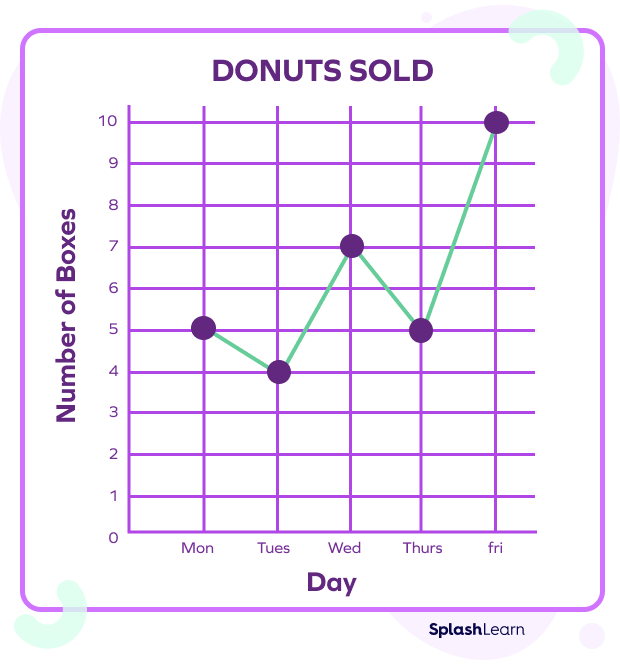
- Using the given data, indicate the values on the graph. Join the points and you’ll see how easy it is to spot the trend now.
- When plotting it, compare multiple items, create a color key to understand what each colored line represents.
Real-life Use of Line Graphs
- Scientists and engineers use these graphs to understand and derive meaning from large chunks of data. Check out the reference image of the graph below.

- Salespersons and businesspersons use them to add depth and validation to their presentations. To compare the sales of two or more products over the same time period, a line graph can be used.

- Mathematicians and statisticians use it to prove and solve their hypotheses and theorems.
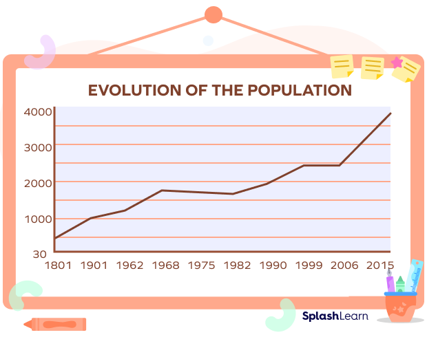
- Governments and private entities use it to showcase trends in different fields, such as yearly population growth, rainfall trends in a particular region, etc.
Disadvantages of a Line Graph
Here are some of the major disadvantages of these graphs:
- If we plot too many lines on the same graph, it can become cluttered and hard to read.
- Application is limited to data sets that have numerical and whole values.
- When data sets have fractional or decimal values, it becomes difficult to plot it.
Benefits of a Line Graph
- It helps to show small shifts that may be getting hard to spot in other graphs.
- It helps show trends for different periods.
- They are easy to understand.
- To compare data, more than one line can be plotted on the same axis.
How to Read a Line Graph
- Find out what the two axes of the graph represent.
- Locate the data points on the graph.
- Draw a line that connects the plots to find out if there is any rise or drop in the trend. For multiple patterns, see if the lines are bisecting each other.
Now let’s do some line graph examples to practice it.
Solved Problems of Line Graph
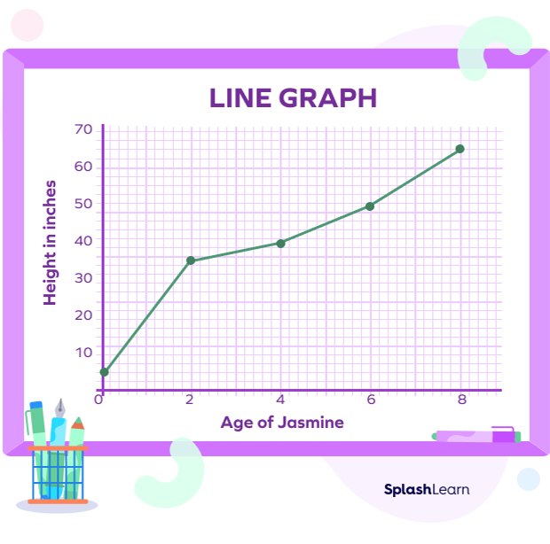
Example 1: The following graph shows Jasmine’s height changes. Understand the graph and try to answer the questions that follow.
Q. What was Jasmine’s height when she was 4 years old?
A. 40 inches
Q. What is the change in Jasmine’s height from 2 years of age to 6 years of age?
A. $50$ $−$ $35 = 15$ inches
Q. When was Jasmine 65 inches tall?
A. 8 years old
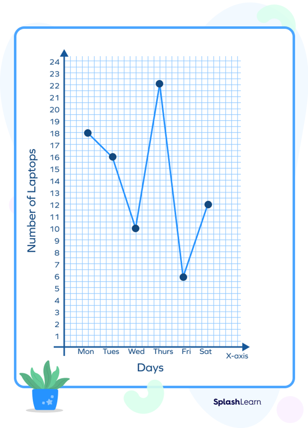
Example 2: The table below shows the sales trend of laptops. Represent the data using a line graph.
| Day | Mon | Tue | Wed | Thu | Fri | Sat |
| No. of laptops sold | 18 | 16 | 10 | 22 | 6 | 12 |
Solution:
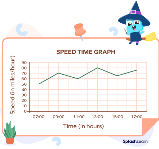
Example 3: The table shows the speed of the car at different hours for the journey of 10 hours, starting at 7:00 hrs.
| Time (in hours) | 7:00 | 9:00 | 11:00 | 13:00 | 15:00 | 17:00 |
| Speed (in miles/hour) | 50 | 70 | 60 | 80 | 65 | 75 |
Solution:
Practice Problems of Line Graph
Line Graph - Definition with Examples
Using the graph, find the days on which the earnings are over $\$$300.
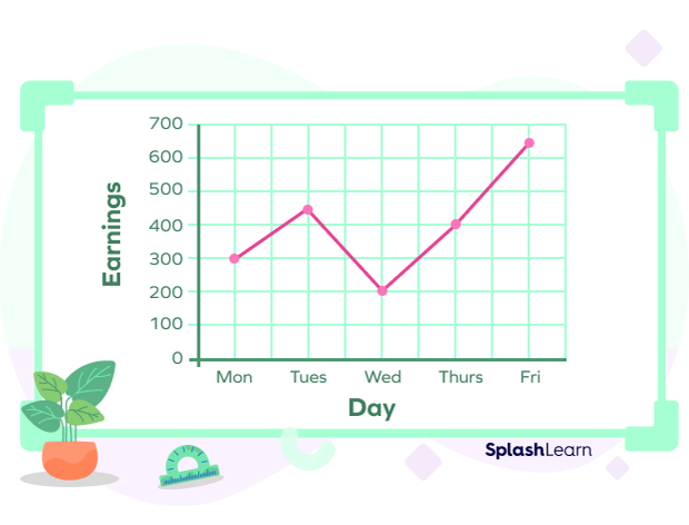
The graph reaches at points higher than 300 for three days: Tuesday, Thursday, and Friday.
Look at the graph below. At what time was it the hottest?
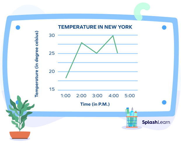
4:00 p.m. as it reached 30℃ then.
Given below is a graph that shows the number of trees planted by an agency every year. Find the year in which the maximum number of trees were planted and the year in which the minimum number of trees were planted.
The graph peaks in the year 2002, when 600 trees were planted. The graph is at the lowest point for the year 1999, when only 200 trees were planted.
Frequently Asked Questions of Line Graph
Can there be more than one line in a line graph?
Yes, there can be more than one line in a line graph. This is usually done when we need to compare two or more sets of information, each set is represented by a line.
Do we always get a straight line in a line graph?
No. The line formed by joining all the data points in a line graph may or may not be straight. The graph with a straight line is called a linear graph.
What is a double line graph?
A double line graph is a type of graph that represents two sets of data or information in a single graph. It is mainly used when we need to compare two sets of information and make inferences.


